Error get alias
FORM is the MESSAGE
ENAME — Brand identity + packaging design for a modern European dental clinic
The dental category is visually overcrowded with blue gradients, stock smiles, and borrowed hospital aesthetics that confuse sterile with trustworthy. ENAMƎ is a brand identity concept built around a different principle: every decision — the name, the mark, the colour system — traces back to the product itself and the profession it represents. Not to what a dental brand is expected to look like.

Services
Brand Identity, Logo System,
Problem
Most dental brands look identical. Walk through any European clinic district and you'll see the same palette — corporate blues, sterile whites, stock photography of perfect smiles that belong to nobody. Brands that signal "medical" instead of "trustworthy." Logos built in an afternoon, not around an understanding of the product.
The result is a category where every brand looks like a placeholder for the real one.
The result is a category where every brand looks like a placeholder for the real one.
Solution
ENAME starts where most dental brands don't — inside the clinic itself.
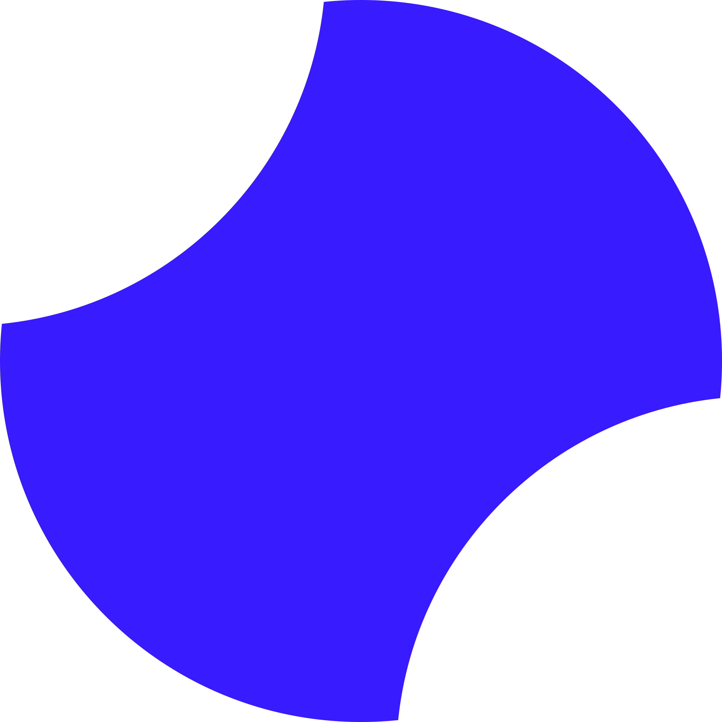
The name comes from enamel: the outermost layer of the tooth, the hardest substance the human body produces. The colour references UV curing light — the violet-spectrum technology used in composite restoration. The logomark is a geometric interpretation of the dental crown, with the letter E revealed through negative space.
Nothing here is decorative. Every decision has a source in the profession it represents. The system works at any scale — from a debossed welcome kit to a 32px app icon — because it was built with that discipline from the start.
The name comes from enamel: the outermost layer of the tooth, the hardest substance the human body produces. The colour references UV curing light — the violet-spectrum technology used in composite restoration. The logomark is a geometric interpretation of the dental crown, with the letter E revealed through negative space.
Nothing here is decorative. Every decision has a source in the profession it represents. The system works at any scale — from a debossed welcome kit to a 32px app icon — because it was built with that discipline from the start.
The Mark and Wordmark
The logomark is a geometric interpretation of the dental crown — the visible part of the tooth, reduced to its essential form. No roots, no detail. Only the silhouette that matters. The letter E is not placed inside the shape — it is cut from it. Negative space does the work. The result is a mark that carries both readings simultaneously: a letter and an anatomical reference, neither announcing itself.
The Wordmark
ENAME is set in a custom condensed typeface derived from Poppins Black. Heavy weight, tight tracking, full capitals. The mirrored E closes the word the same way the mark closes its form — as a reflection, not a repetition. The colour of the mark references UV curing light — the violet-spectrum technology used in composite restoration. Not decorative. Functional by origin.
The Wordmark
ENAME is set in a custom condensed typeface derived from Poppins Black. Heavy weight, tight tracking, full capitals. The mirrored E closes the word the same way the mark closes its form — as a reflection, not a repetition. The colour of the mark references UV curing light — the violet-spectrum technology used in composite restoration. Not decorative. Functional by origin.

Typography
Poppins — the only typeface in the system.
Not because of limitation, but because of discipline.
One typeface used with intention across six weights
creates more cohesion than two typefaces used carelessly.
Bold — headlines and section titles
Medium — subheadings, labels, UI elements
Regular/ Light — body text, descriptions,
patient-facing copy
Poppins is geometric without being cold,
readable without being generic.
It holds the brand's warmth at small sizes
and its confidence at large ones.
One typeface used with intention across six weights
creates more cohesion than two typefaces used carelessly.
Bold — headlines and section titles
Medium — subheadings, labels, UI elements
Regular/ Light — body text, descriptions,
patient-facing copy
Poppins is geometric without being cold,
readable without being generic.
It holds the brand's warmth at small sizes
and its confidence at large ones.


Brand Attributes
Six words. Every visual decision in this system can be traced back to at least one of them.
Precision — nothing is accidental
Trust — consistency builds confidence
Modern — relevant without chasing trends
Care — warmth is a design decision
Clarity — negative space is not emptiness
Confidence — the brand does not explain itself
Precision — nothing is accidental
Trust — consistency builds confidence
Modern — relevant without chasing trends
Care — warmth is a design decision
Clarity — negative space is not emptiness
Confidence — the brand does not explain itself


Other Projects

If you’re building something in health or medicine that deserves to look as serious as it is —
Let's talk